In this post I will show how you can make some configurations on ADF graphs.
1- Change Y-axis minimum vale
Sometimes you need to start Y-axis by specific value (by default it start by 0) but what if you need Y-axis start by 20 or 50 or .... you can do the following:
Settings:
In the graph component insert dvt:y1Axis and from property inspector set AxisMinValue by the the desire value or by expression and set AxisMinAutoScaled to false

The Result will be like this:

2- Remove decimal from pie slice label(display integer values)
Settings:

Result:
3- Change X-axis fonts and color
Settings:

Result:

4- Change Y-axis fonts and color
Settings:

Result:


10- Hide graph tooltip
Settings:

Result:

11- Display a horizontal line inside bar graph
Sometime we need to display a horizontal line in bar graph the line value will be a specific value to know which bar value will be above the line and which will be below the line value.
To do that insert inside dvt:barGraph --> referenceObjectSet --> referenceObject
as
Settings:

Result:

12- Change bubble graph background and vert/horiz lines color
The original graph will be like this

You can fill the graph by set dvt:graphPlotArea fillColor="#bac5d6" and fillTransparent="false" as
the result will be like


13- Formatting Metric and Tick Labels for a Gauge
the metric and tick labels are by default displaying their values as e.g "2.0K". Also, the metric label is displayed below the gauge which takes unnecessary vertical space.
if you want to display the values like 2000 instead of 2.0K :
Settings:
set gauge tickLabel and metricLabel scaling="none"

Result:

14- Display bar values of dvt:barGraph in the top of each bar
Inside the bar add dvt:markerText like:
Result:

15- Add currency symbol beside gauge value
To add currency symbol beside gauge value add inside gauge dvt:metricLabel and inside it add dvt:numberFormat as:
Result:

1- Change Y-axis minimum vale
Sometimes you need to start Y-axis by specific value (by default it start by 0) but what if you need Y-axis start by 20 or 50 or .... you can do the following:
Settings:
In the graph component insert dvt:y1Axis and from property inspector set AxisMinValue by the the desire value or by expression and set AxisMinAutoScaled to false
The Result will be like this:
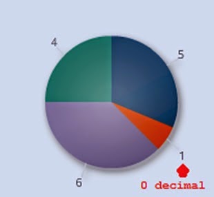
2- Remove decimal from pie slice label(display integer values)
Settings:
Result:
3- Change X-axis fonts and color
Settings:
Result:
4- Change Y-axis fonts and color
Settings:
Result:
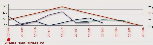
5- Rotate X-axis text
Settings:
Result:
5- Pie display value
Settings:
Result:
6- Pie display
percentage
Settings:
Result:
7- Change Pie Slice label
text fonts and colors
Settings:
Result:
8 - Pie change Legend
text fonts and colors
Settings:
Result:
9- Pie select multiple
slices
Settings:
Result:
To read selected value you can use this code
10- Hide graph tooltip
Settings:
Note: You can use MarkerTooltipType and SeriesTooltipLabelType properties to display/hide some information from graph tooltip
Result:
11- Display a horizontal line inside bar graph
Sometime we need to display a horizontal line in bar graph the line value will be a specific value to know which bar value will be above the line and which will be below the line value.
To do that insert inside dvt:barGraph --> referenceObjectSet --> referenceObject
as
Settings:
Result:
12- Change bubble graph background and vert/horiz lines color
The original graph will be like this
You can fill the graph by set dvt:graphPlotArea fillColor="#bac5d6" and fillTransparent="false" as
the result will be like
if you want to change the color of the vertical and horizontal lines you can change it by adding dvt:y1MajorTick and dvt:x1MajorTick inside as
the result will be like:
If you want to hide all vertical and horizontal lines set dvt:y1MajorTick and dvt:x1MajorTick as
The result will be
13- Formatting Metric and Tick Labels for a Gauge
the metric and tick labels are by default displaying their values as e.g "2.0K". Also, the metric label is displayed below the gauge which takes unnecessary vertical space.
if you want to display the values like 2000 instead of 2.0K :
Settings:
set gauge tickLabel and metricLabel scaling="none"
Result:
14- Display bar values of dvt:barGraph in the top of each bar
Inside the bar add dvt:markerText like:
Result:

15- Add currency symbol beside gauge value
To add currency symbol beside gauge value add inside gauge dvt:metricLabel and inside it add dvt:numberFormat as:
Result:

Thank you for your article, it really helped me.
ReplyDeleteYou are welcome
Delete